Vision Bank
Designing a scalable digital banking experience for one of Saudi Arabia's first fully digital banks.
Helping shape a fully digital bank
Vision Bank was one of Saudi Arabia's first fully digital banks, created to provide modern banking solutions tailored to citizens across the Kingdom.
I joined the project as part of the UX/UI and design systems team, helping shape customer journeys, scalable UI patterns, and white-label banking foundations across mobile and web.
Over the course of nine months, I worked across multiple streams of the product - from analysing customer journeys and defining UI patterns to building concept prototypes and contributing to a multi-product design system library.
Responsibilities
- Customer journey analysis
- UX/UI design
- Design systems
- White-label banking frameworks
- Wireframing and prototyping
- Component documentation
- Stakeholder collaboration
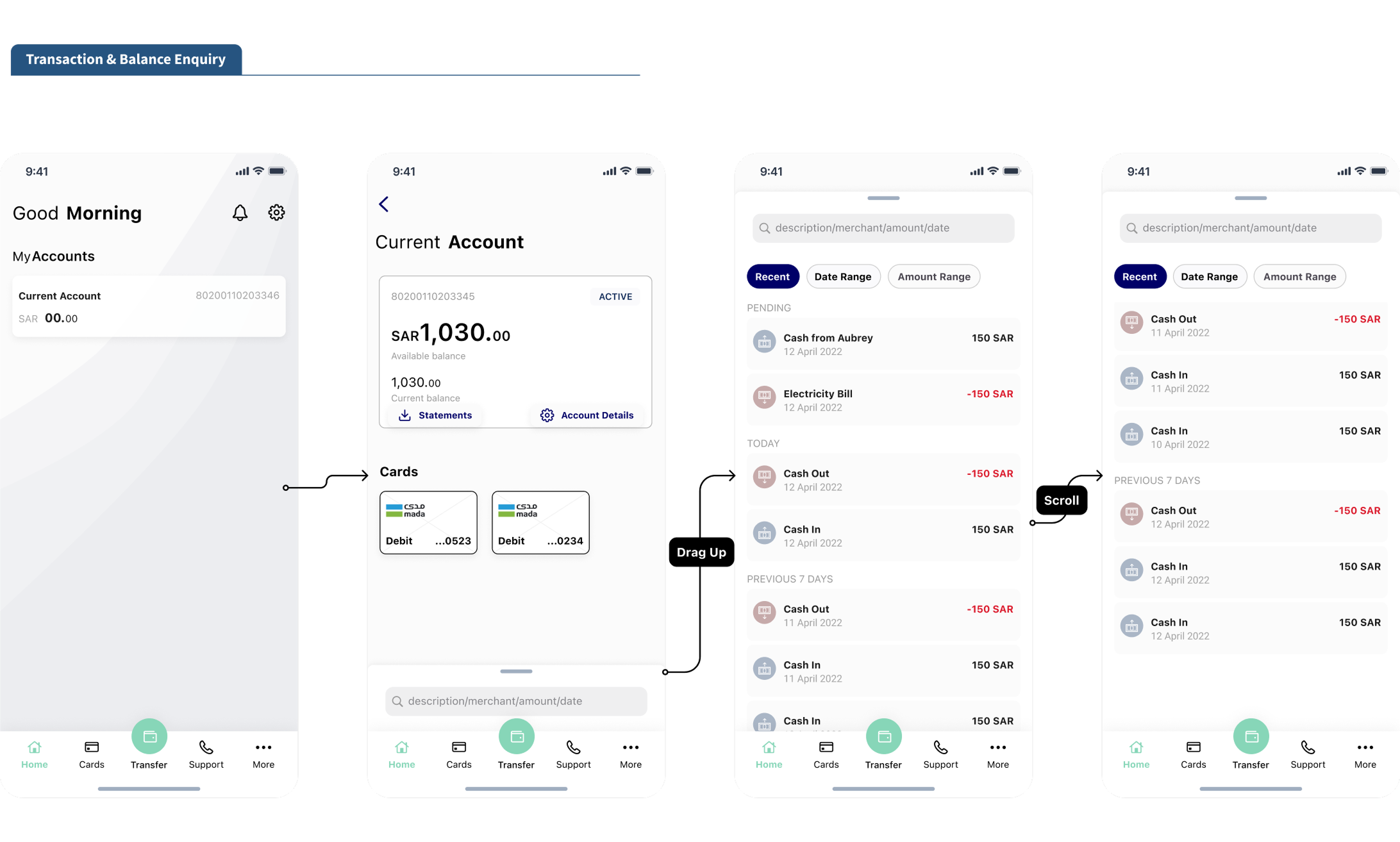
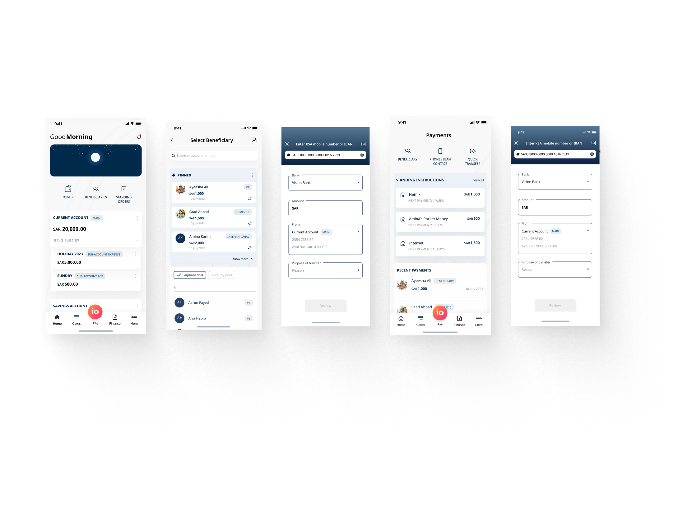
Analysing customer journeys
The client provided a series of banking flows and business requirements created by business analysts, which the design team translated into low-fidelity customer journeys across both retail and SME banking experiences.
Because the product was still being defined, many journeys evolved continuously as new requirements, stakeholder feedback, and technical considerations surfaced throughout the project. My role focused on helping visualise these flows in a scalable way while ensuring the experiences remained intuitive, consistent, and aligned with iOS usability guidelines.
Alongside the UX work, I also contributed toward building the foundations of the white-label design system, which became increasingly important as the product ecosystem expanded.
Main contributions
- Analysing customer journeys and translating business requirements into wireframes and UX flows
- Contributing toward the white-label design system strategy and structure
- Creating reusable iOS-focused components, styles, and documentation
- Designing low and high-fidelity wireframes across retail and SME banking apps
- Ensuring UX principles and platform-specific guidelines were consistently applied
Challenges
One of the biggest challenges was navigating the number of stakeholders involved in the decision-making process. Requirements and feedback often shifted mid-stream, which created misalignment around priorities and implementation expectations.
To reduce friction and improve collaboration, smaller workshops were introduced with only the necessary stakeholders involved. This helped streamline discussions, reduce conflicting feedback loops, and create clearer alignment before design work progressed further.
Lessons
This project highlighted the importance of clearly defining what “ready” and “done” mean at the beginning of a project.
Without strong alignment upfront, the design process became more reactive than iterative - with time often spent resolving planning gaps that should have been clarified before design tasks began.
It reinforced how important structured planning and implementation alignment are in creating efficient product teams.
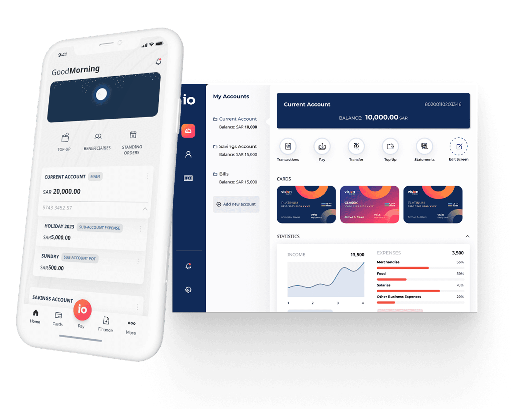
Visualising through concepts and prototyping
During the early stages of the product, concept designs were explored to help define the visual tone and future direction of the banking experience.
Using inspiration from existing banking products, interaction trends, and the client's proposed colour palettes, I created a series of mobile and tablet concepts focused on creating a clean, modern, and minimal banking experience. These concepts included interactive prototypes, motion explorations, and micro-interactions to help stakeholders better visualise how the product could feel in practice.
Although the final approved visual direction later shifted toward a different style, the concept phase played an important role in exploring possibilities and shaping early product conversations.
Main contributions
- Creating mobile banking concepts, mockups, and interactive prototypes
- Designing tablet banking concepts and responsive layouts
- Exploring motion design and micro-interactions for key banking journeys
- Producing presentation-ready visuals and prototype videos for stakeholder reviews
- Extending newly approved visual styles across future product screens and components
Challenges
One of the more difficult aspects of the concept phase was the lack of established branding or visual direction from marketing.
With minimal constraints, there was a very broad interpretation of what the app could look and feel like. Feedback often became more subjective around personal visual preference rather than solving product problems.
Lessons
This phase taught me the importance of aligning on product vision and visual direction before heavily investing in exploratory concept work.
While concepts are valuable for sparking conversations and creating excitement, they become significantly more effective when paired with clearer strategic direction and stakeholder alignment early in the process.
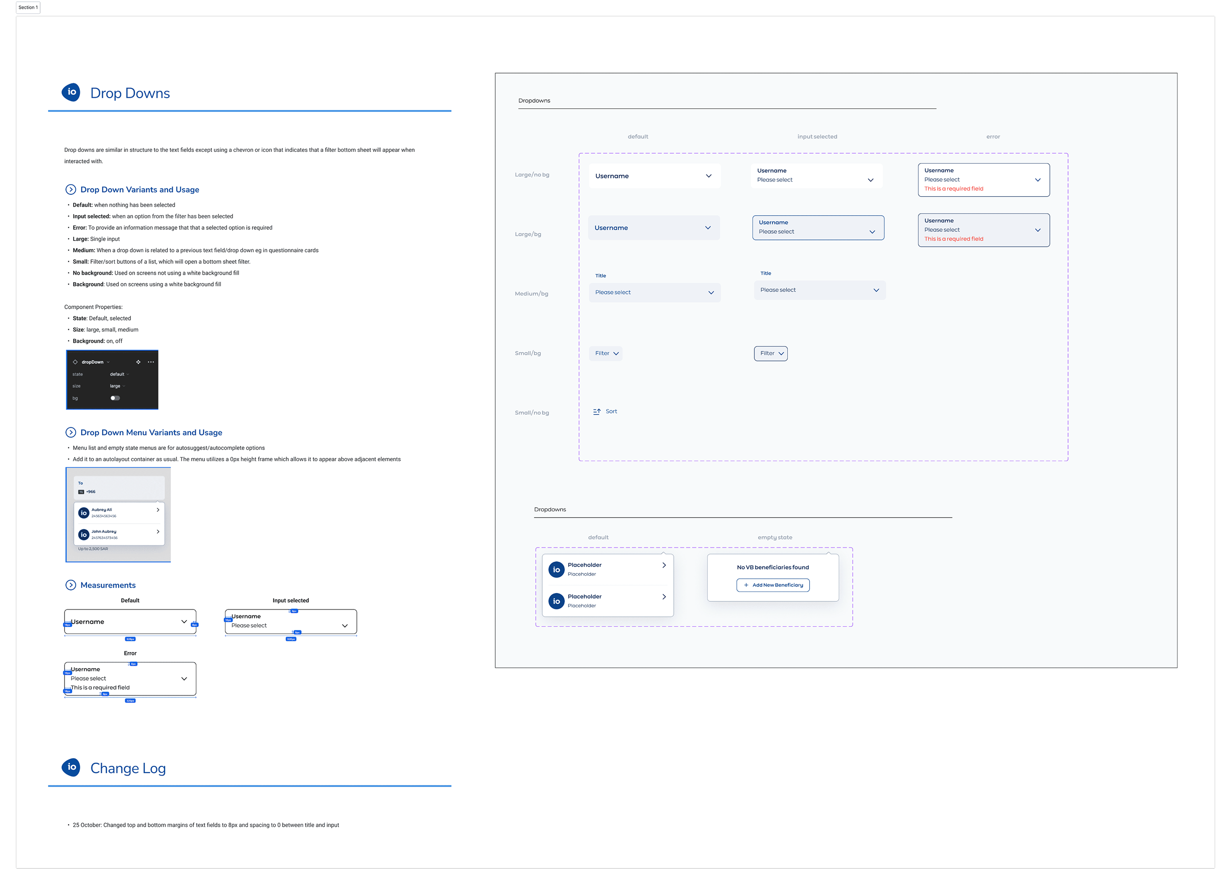
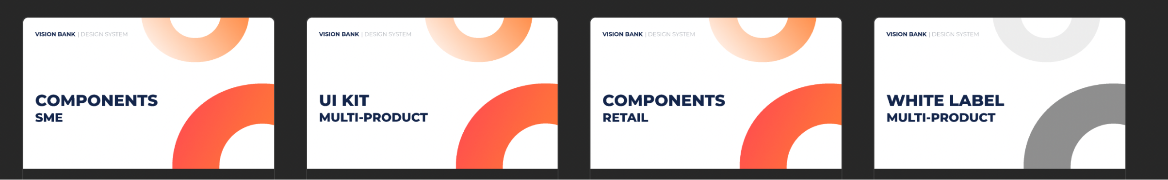
Strategising a multi-product design system library
As the product ecosystem expanded, the need for a scalable and maintainable design system became increasingly important.
Before high-fidelity screens could be rolled out consistently across products, the design system foundations needed to account for scalability, white-label flexibility, responsiveness, and long-term maintainability.
To support this, I helped structure the system around a shared base UI kit that could be published into multiple product libraries and then styled independently based on brand requirements. This allowed the team to maintain consistency across products while still supporting future visual variations.
Main contributions
- Structuring the design system architecture for multi-product consistency
- Creating responsive high-fidelity components using Figma best practices
- Establishing reusable patterns and scalable component libraries
- Writing detailed documentation for usage, maintenance, and contributions
- Maintaining and evolving the design system as product requirements changed
Challenges
I was given ownership of the design system while also balancing broader product responsibilities, which created a significant overlap between strategic systems work and ongoing backlog tasks.
Because the design system needed to function as a product in itself, I shifted focus toward ensuring its long-term scalability and usability for the wider design team.
This included refining component structures, improving documentation, and creating clearer implementation guidance so designers could work more efficiently during high-fidelity rollout phases.
Lessons
This project became one of my first opportunities to work deeply within a large-scale design system environment.
It strengthened my understanding of scalable component architecture, documentation practices, and systems thinking - and ultimately sparked my long-term interest in specialising further within design systems and scalable product design.
Building consistency across products
The work contributed toward creating a more scalable and consistent banking experience across both mobile and tablet platforms.
A major focus of the project was establishing the early structural foundations for the design system. I helped define a layered system approach where a shared black-and-white base UI kit acted as the core foundation for reusable components and interaction patterns.
From there, separate retail and SME libraries could inherit the same component structure and behaviour while applying their own branding, colour palettes, and visual styling. This allowed the products to maintain consistency in usability and implementation while still feeling distinct for different audiences.
Although the design system continued evolving after my involvement, the initial structure, organisation, and scalable approach helped create a stronger foundation for future designers and product expansion.
Outcomes
- Established the foundational structure for a scalable multi-product design system
- Improved consistency across retail and SME banking experiences
- Enabled white-label flexibility through shared component foundations
- Reduced duplicated design effort through reusable UI patterns and libraries
- Supported more efficient high-fidelity rollout workflows for future designers
- Created scalable component and documentation foundations for long-term system growth