Vitality
Redesigning a global rewards experience used across multiple markets - while balancing consistency, localisation, and usability at scale.
What I walked into
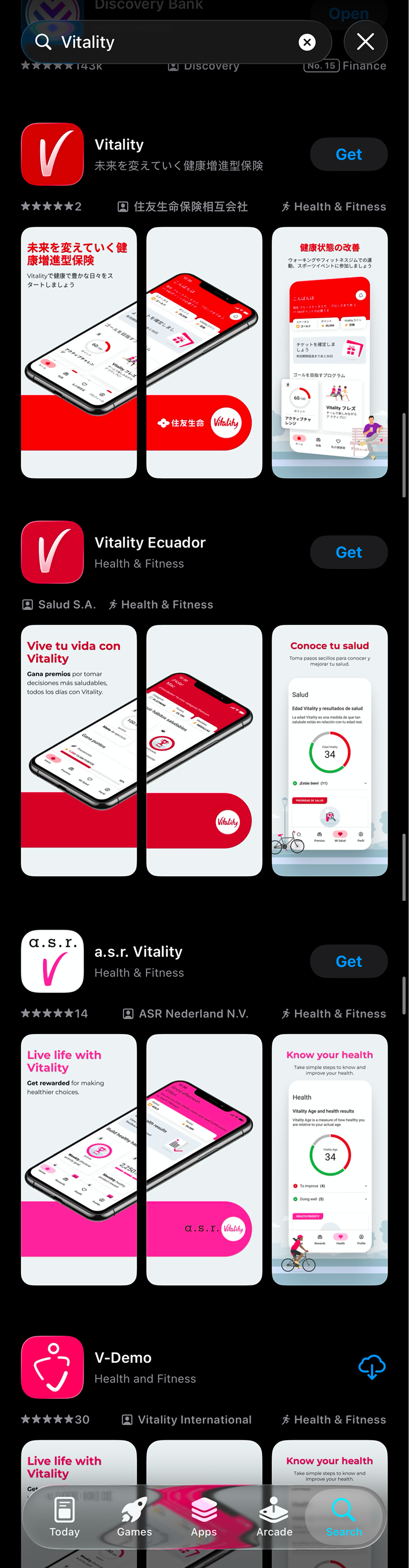
Vitality runs across more than ten markets. The rewards experience had grown fast over the years, but the product experience hadn't really kept up.
Different markets handled things differently. Components behaved inconsistently between regions, some flows were difficult to maintain, and users often struggled to understand how their rewards status worked, how points accumulated year-to-year, or what actions would actually help them progress.
At the same time, new features kept getting added - partner rewards, streaks, activity goals, status systems - but there wasn't always a shared structure behind them.
The challenge quickly became bigger than visual polish.
How do we create consistency across markets without removing the flexibility each region needs?
By the time I joined, the team had already started migrating from Sketch to Figma. The bigger goal was much more ambitious: create a global design system, overhaul the UX, and support a single codebase that every market could localise - from language and brand colours to feature configuration and bespoke modules for regional needs.
Essentially, a high-fidelity white-label app.
Built once, shipped everywhere, owned locally.
Building structure that could scale
At the start, we leaned heavily on the existing components so we could ship quickly. That stopped working pretty fast.
Usability testing kept surfacing the same friction points. Users were missing info icons, fixed tabs caused issues across different flows, and some of the older patterns simply couldn't support the new features being added.
So we started replacing them.
One small change that ended up having a surprisingly big impact was replacing tooltip-style info icons with in-place bottom sheets. They were easier to discover, worked better for longer translated content, and gave users more context without pushing them into another screen.

That pattern eventually became reusable across the app anywhere we needed to surface supporting information.
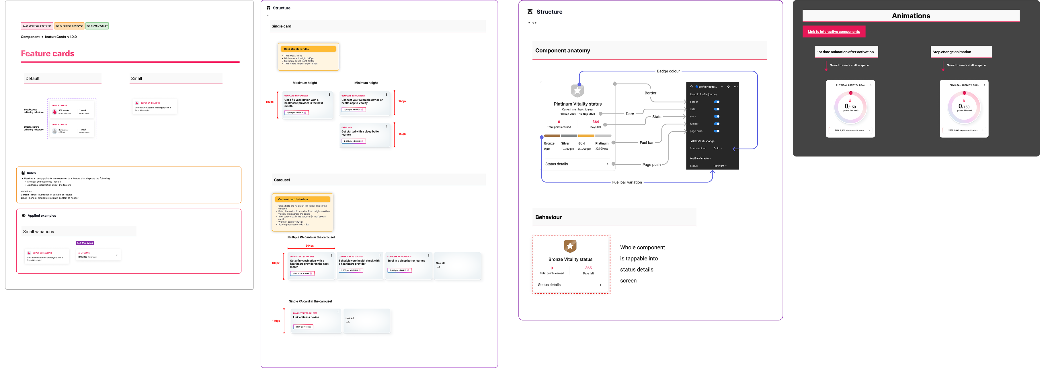
At the same time, I was helping build the spine of the design system underneath it all.
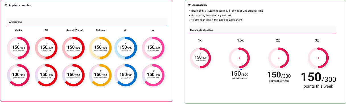
I set up Figma variables so each market could plug in its own colour palette, then rebuilt components to consume those variables. It meant a designer could swap a screen from Mexico to Japan to Portugal almost instantly without rebuilding layouts from scratch.
A lot of my work focused on making the system more scalable for both designers and developers:
- defining auto-layout structures and component properties
- improving accessibility and readability for translated content
- reducing inconsistencies in spacing, hierarchy, and interaction patterns between markets
- organising documentation so components were easier to find and use
- creating handoff conventions developers could reliably work from
We even introduced a lightweight versioning system directly inside Figma using emoji statuses and semantic versioning - things like 🔵 Built, 🟡 In Review, or ⚫ Concept paired with suffixes like _V1.0.0 and linked to the dev backlog.
Design system stats
Making complicated information easier to understand
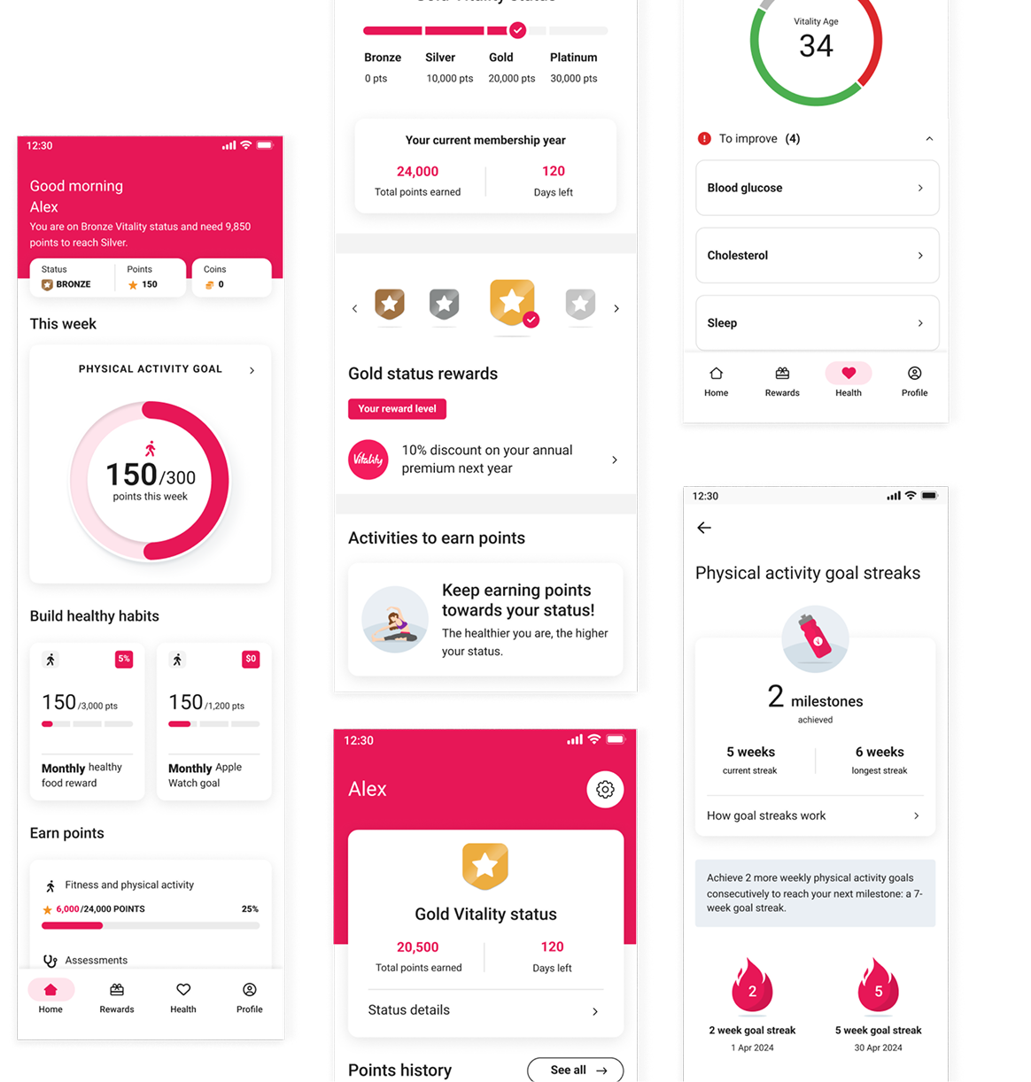
Vitality's reward logic could get complicated fast. A user's current rewards and status often depended on last year's points, whether they maintained activity levels, and how this year compared historically.
Previously, most of that logic was explained through walls of text spread across multiple screens.
The app relied heavily on points, streaks, activity goals, and status systems, but a lot of the information felt abstract or disconnected. Users often didn't understand:
- why their status changed
- how many points they still needed
- what counted toward progression
- or how different reward systems connected together
The challenge became less about “explaining” the system, and more about teaching it visually.
I explored ways to make complex information feel clearer and more motivating through:
- simplified reward breakdowns
- clearer hierarchy and progress states
- data visualisation concepts for trends and achievements
- restructuring how information was grouped and surfaced
One example was reworking the yearly rewards progression flow.
Instead of relying on long-form explanatory copy, we replaced it with a swipeable carousel that visually showed:
- rewards unlocked at each level
- how progression carried over year-to-year
- and what users needed to maintain their status
The solution reduced the amount of translated copy significantly, while making the experience easier to scan and understand across markets.
The balance was tricky - the UI needed to feel visual enough for quick comprehension, but still generic enough to support localisation and avoid endless content variations between regions.
A lot of the improvements were subtle, but together they removed a surprising amount of friction. Usability sessions that previously ended in confusion started ending with users explaining the reward system back to us in their own words.
Making AI-driven goals feel understandable
One of the more complex problems I worked on was an AI-personalised activity feature designed to help members re-engage with physical activity.
The feature originally started as a “points booster” - earn more points for fewer steps. The intention was to reward consistency, but Vitality's points system was already complicated, and “more points for less activity” confused almost everyone we tested it with.
We explored multiple ways to frame it. None of them survived review.
As the US and UK teams joined the rollout, the feature evolved alongside input from the clinical and data science teams. Instead of boosting points, the AI would lower a member's activity target when disengagement was detected.
For example:
- the standard target might drop from 7,500 steps to 2,500
- points goals adjusted alongside it
- and the target would gradually increase again as engagement improved
The idea became much easier to explain:
Make the goal achievable first, then gradually build the habit back up.
That solved the product problem.
The design problem that replaced it was:
How do users notice, trust, and understand that their goal just changed?
The AI needed to feel intentional, not like a bug or random system behaviour.
At the same time, marketing wanted the feature to feel visually distinct from the standard program rather than hidden as quiet personalisation.
I designed interaction patterns and microanimations to reinforce the transition:
- the activity ring shifted into a gradient state when AI activated
- shimmer effects appeared across AI-driven surfaces
- goal values animated down from 7,500 to 2,500
- the ring colour transitioned as the programme adapted
The motion wasn't there for decoration. It was what made the change legible.
By the time the feature shipped, it had already been reframed multiple times across product, clinical, data science, and marketing requirements.
A large part of the design challenge became holding the experience together through all of those shifts - while making sure users still understood what was happening to their goals, and why.
Designing for scale across markets
The work contributed to a more scalable and maintainable product experience across multiple markets, while improving usability across key parts of the rewards journey.
Outcomes
- Reduced inconsistencies across shared experiences
- Improved clarity around rewards and status systems
- Increased efficiency when building and maintaining components
- Reduced design and QA overhead across teams
- Created stronger alignment between design and development

Measurable impact
Designing for systems, not just screens
This project taught me a lot about designing beyond individual screens and thinking about the wider ecosystem around a product.
The end-user wasn't the only audience. I also had to think about:
- the regional teams inheriting and localising the product
- the designers and developers consuming the system
- and the realities of multiple teams building in parallel under different constraints
I learned pretty quickly that good system design isn't about making everything identical.
It's about creating enough structure for teams to move efficiently, while still leaving room for flexibility where it matters.
At enterprise scale, design system maturity becomes less about creating shiny new components and more about governance, reuse, documentation, and knowing when existing patterns are no longer enough.
Because eventually, new constraints arrive.
AI features get introduced. Markets diverge. Multiple dev teams start building simultaneously. What once felt scalable suddenly starts showing cracks.
That's when systems need to evolve.
The hardest design problems usually aren't visual. They're structural.
And at this scale, design systems stop being about consistency alone.
They become about making variation survivable.
Honestly, those are the kinds of problems I enjoy solving most.